





Brief
Brief
Brief
To art direct, design and execute a cohesive brand campaign that encourages consumers - ages 25 to 45 - to choose Bash as their primary online destination for fashion and lifestyle.
All channels including web, social and email needed to be considered, all done within the existing Bash brand framework, with the freedom to incorporate creative elements, colour palette additions etc.



Testing concepts
Testing concepts
Testing concepts
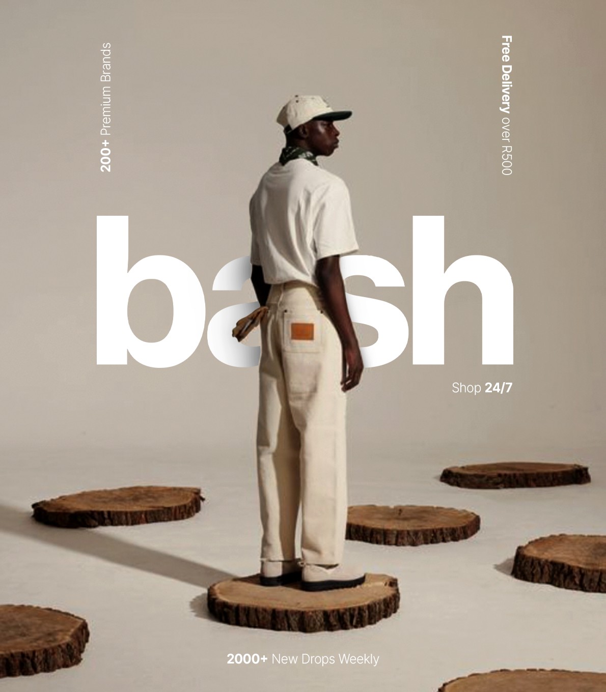
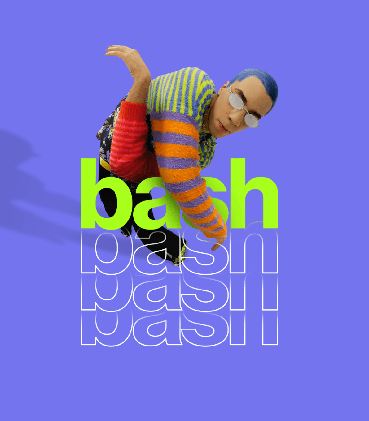
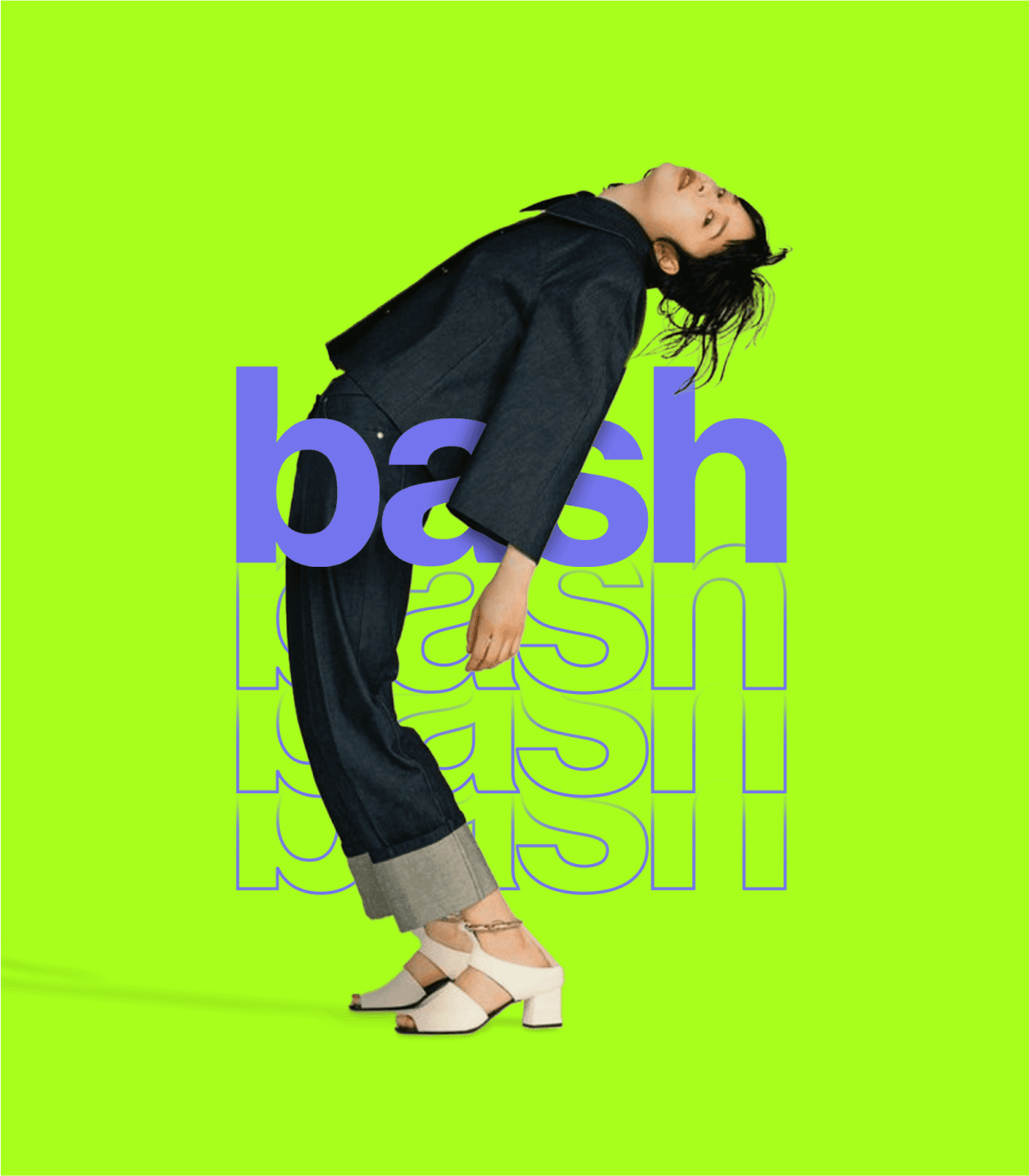
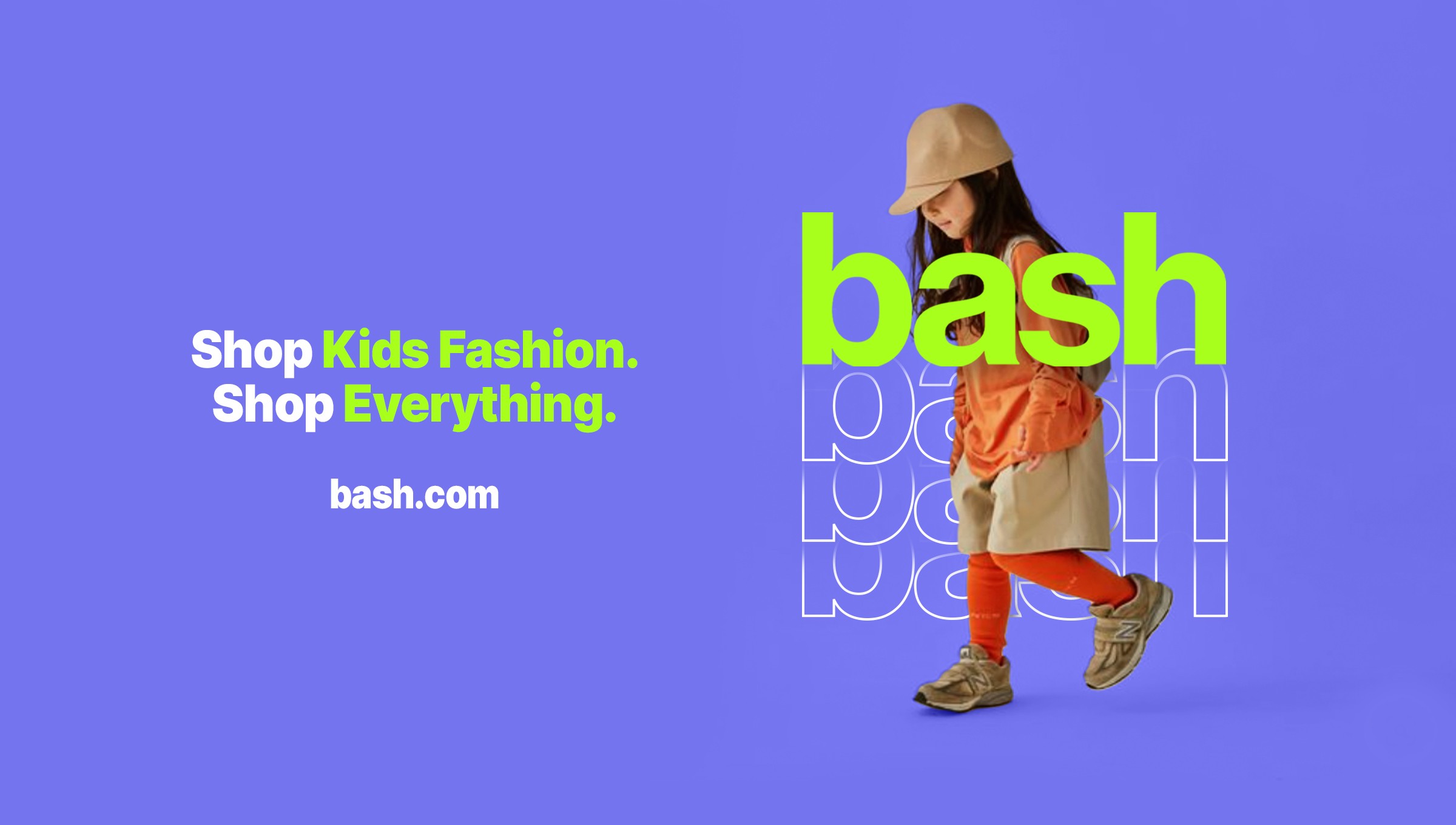
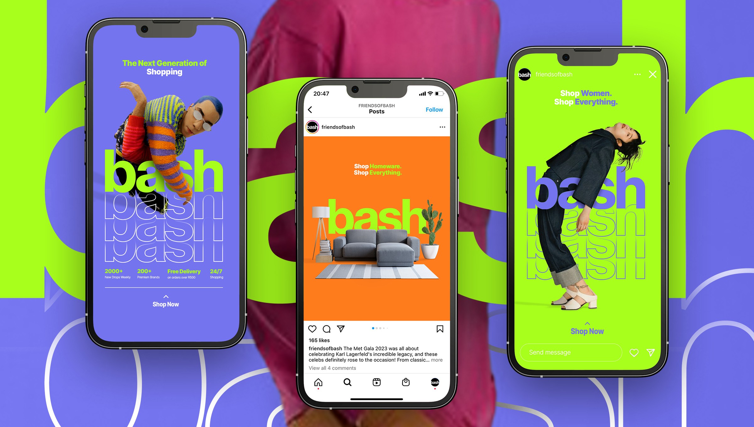
The campaign concept aimed to boost brand awareness by showcasing Bash's offerings while prominently featuring the brand itself. I adopted a trendy visual style blending imagery and typography to create depth, with Bash as the focal point. The hero copy, 'The Next Generation of Shopping,' introduces Bash as an innovative newcomer.
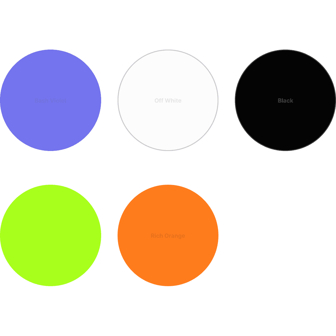
Additionally, I introduced 'acid green' and 'rich orange' to the color palette to provide contrast with the existing colors and offer more versatile options for layouts and their variations.
To ideate and execute a brand campaign, spanning across all channels, that encourages consumers - ages 25 to 45 - to consider Bash as their number 1 online destination for fashion and lifestyle.
The campaign concept aimed to boost brand awareness by showcasing Bash's offerings while prominently featuring the brand itself. I adopted a trendy visual style blending imagery and typography to create depth, with Bash as the focal point. The hero copy, 'The Next Generation of Shopping,' introduces Bash as an innovative newcomer.
Additionally, I introduced 'acid green' and 'rich orange' to the color palette to provide contrast with the existing colors and offer more versatile options for layouts and their variations.





Coming togther
Coming togther
Coming togther
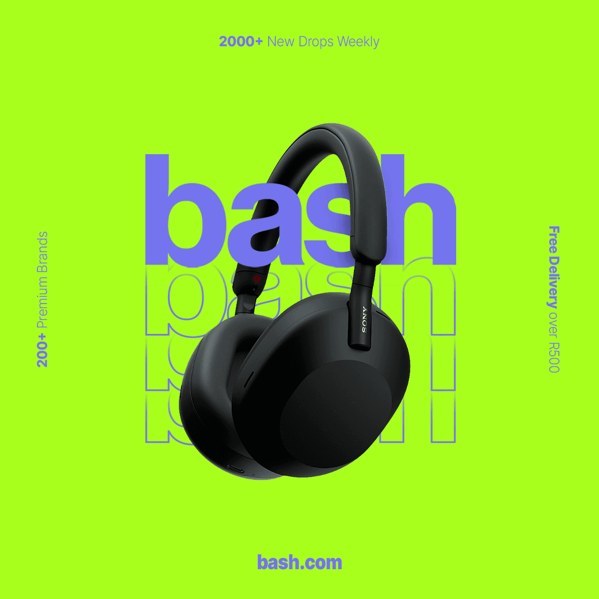
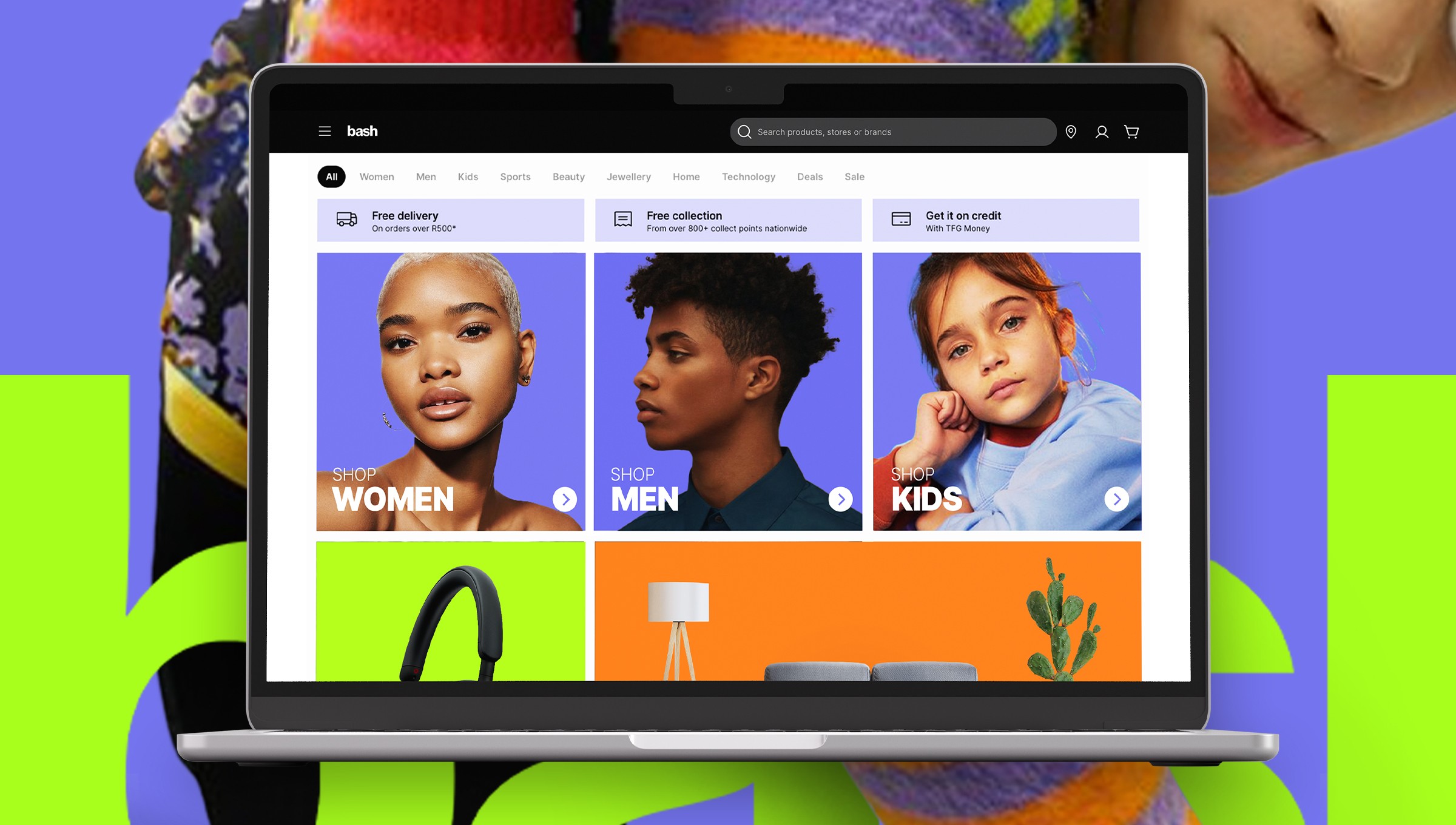
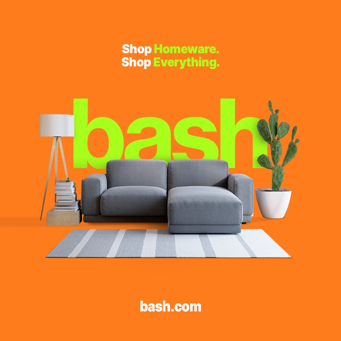
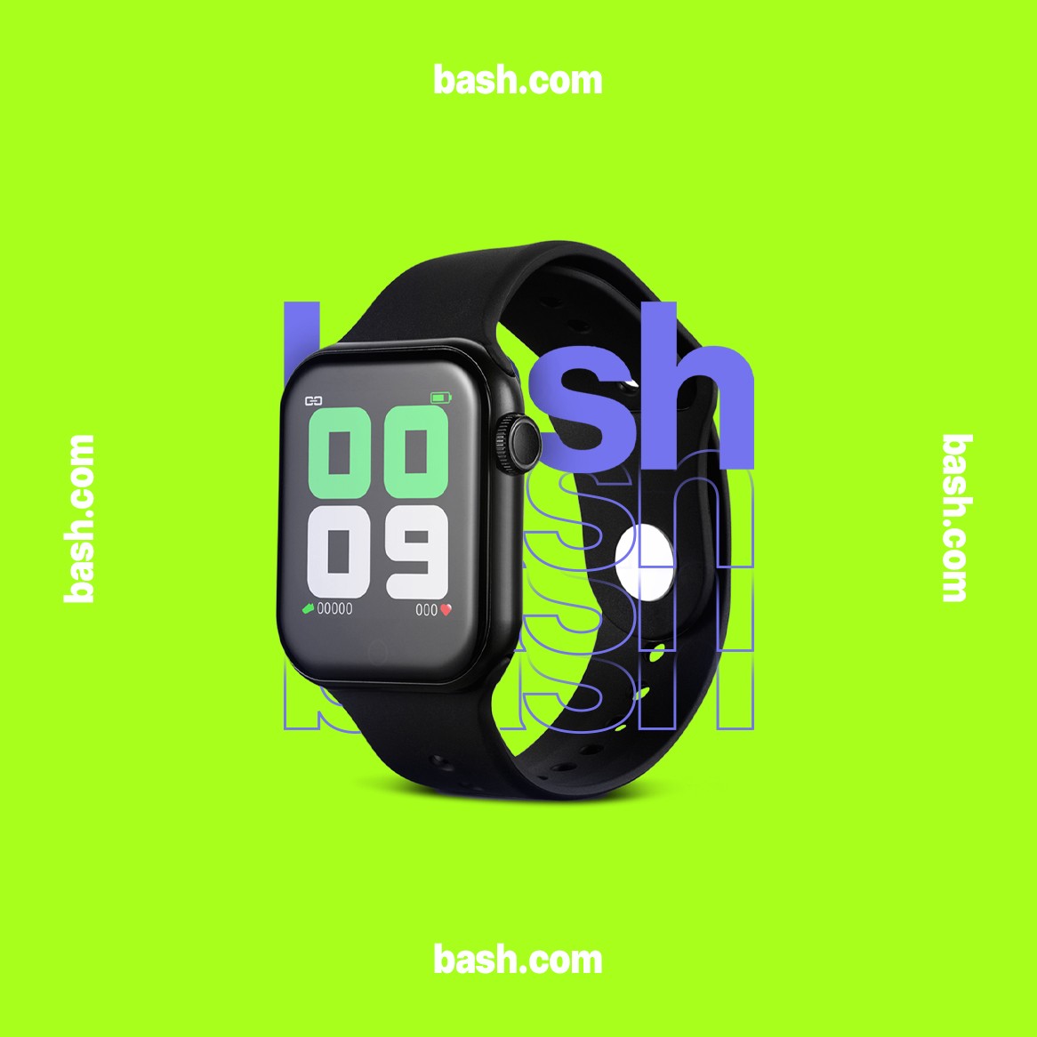
I utilised the expanded color palette to distinguish between the brand's offerings - fashion, homeware, and tech - assigning Bash Violet to the primary fashion line, green to tech, and orange to homeware.
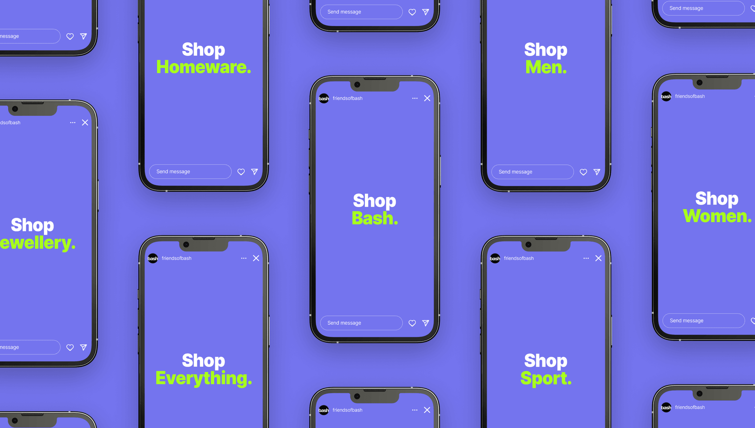
This colour concept, combined with the depth-enhancing visual style, was applied to the existing site design and incorporated into all social media creative campaign concepts.








Considerations
Considerations
Considerations
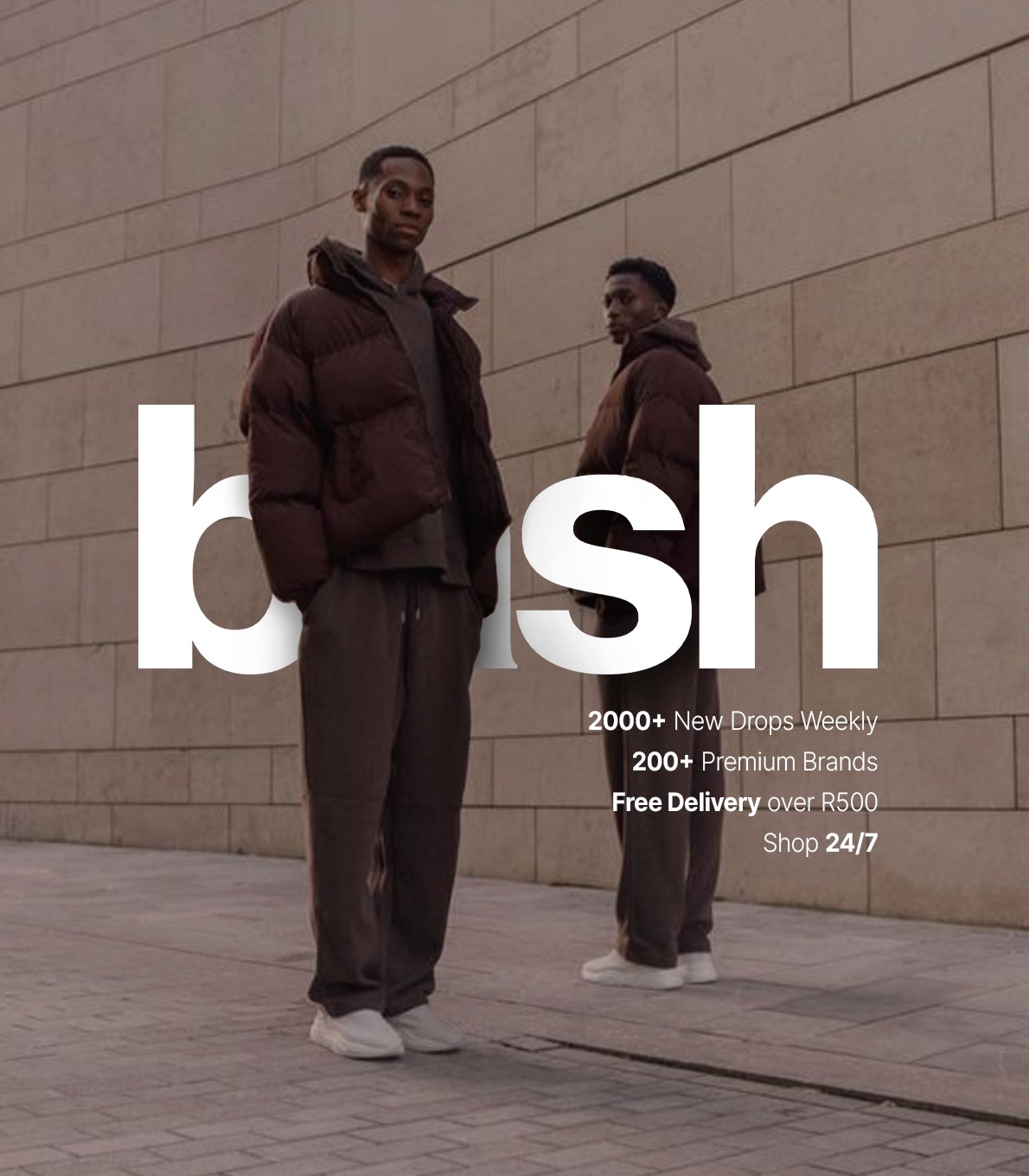
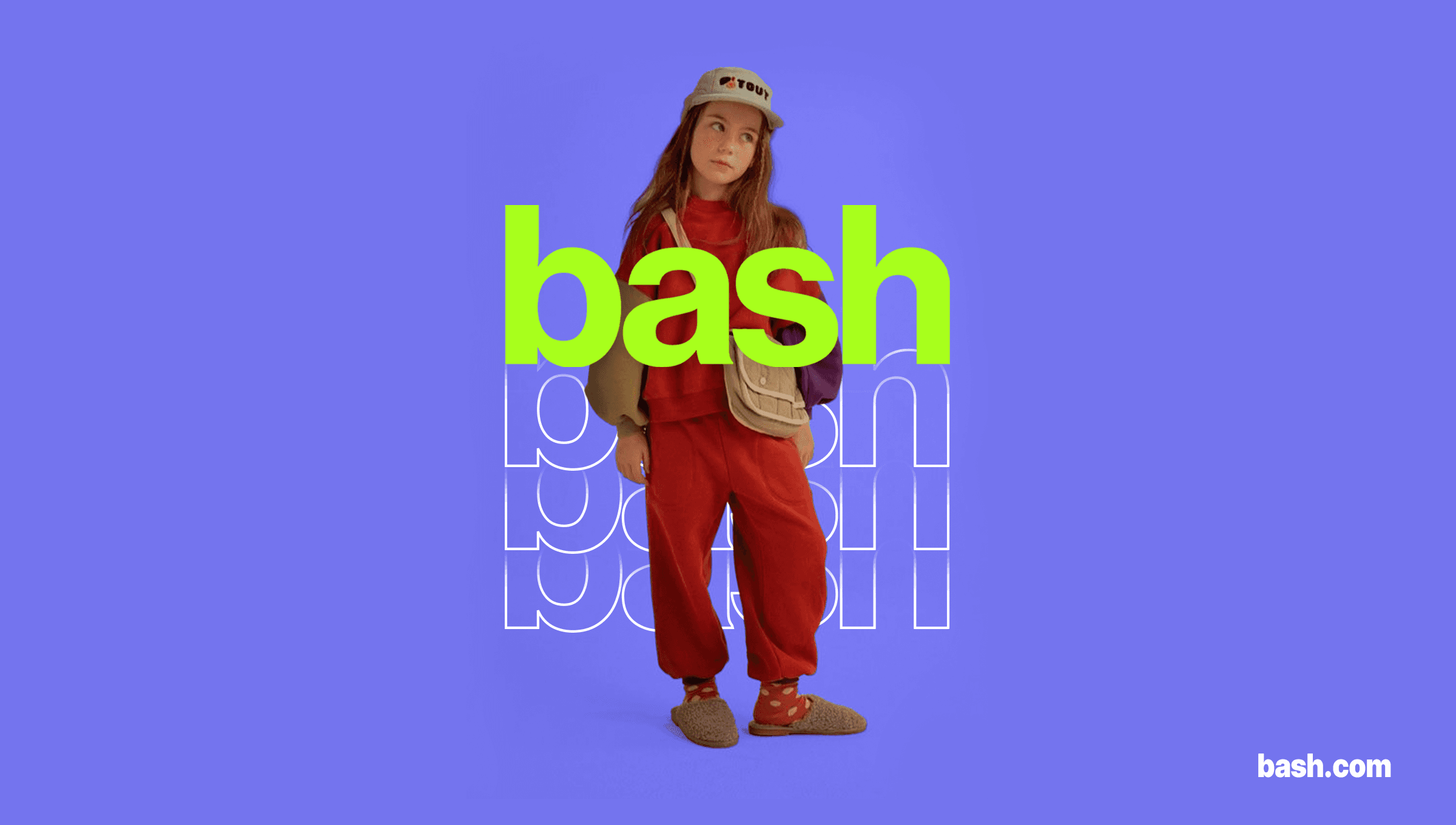
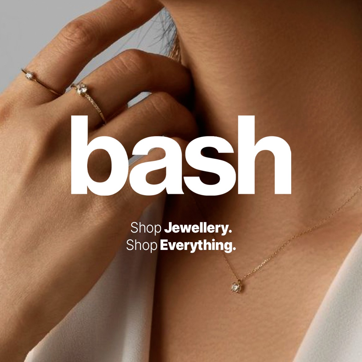
Additionally, I explored a more accessible option using lifestyle shots for instances when creating images wasn't practical. These lifestyle shot artworks omitted the color segmentation but retained the original type/subject depth concept.
Having great interest in the fashion and ecommerce sectors, I'm delighted with how this campaign concept and vision came together.
